Contrast is one of the most essential components of photography. When used effectively, it creates clarity, texture, shadow, tone, and light in an image. It can help you draw attention to particular elements of a photo or even emphasize your subject.
In this article, we’re going to concentrate on high contrast against low contrast photography. Both produce dramatic effects that can enhance your work in different ways. Let’s take a closer look at what contrast is, how high and low differ, and how you can use it to improve your photos.
An Overview of Contrast
Contrast is the degree of difference between the tones and colors in a photo. You can think of it as the ratio of tones or the ratio between the light and dark areas of an image.
High-contrast and low-contrast leave viewers with different impressions and change the impact and feel of your photos. For example, high-contrast photos typically have less noticeable details but more evident textures, whereas low-contrast ones possess more visible individual elements.

To create this tonal disparity, photographers can use several methods with high contrast and low contrast. You can adjust camera settings and light, alter your photos’ composition, or manipulate it in editing. Two of the most popular of these techniques are color and tone.
Color uses interactions between shades to enhance your photos, while tone is the variance in brightness in a photo. We’ll discuss using these methods for high contrast and low contrast in a moment.
High Contrast Photography
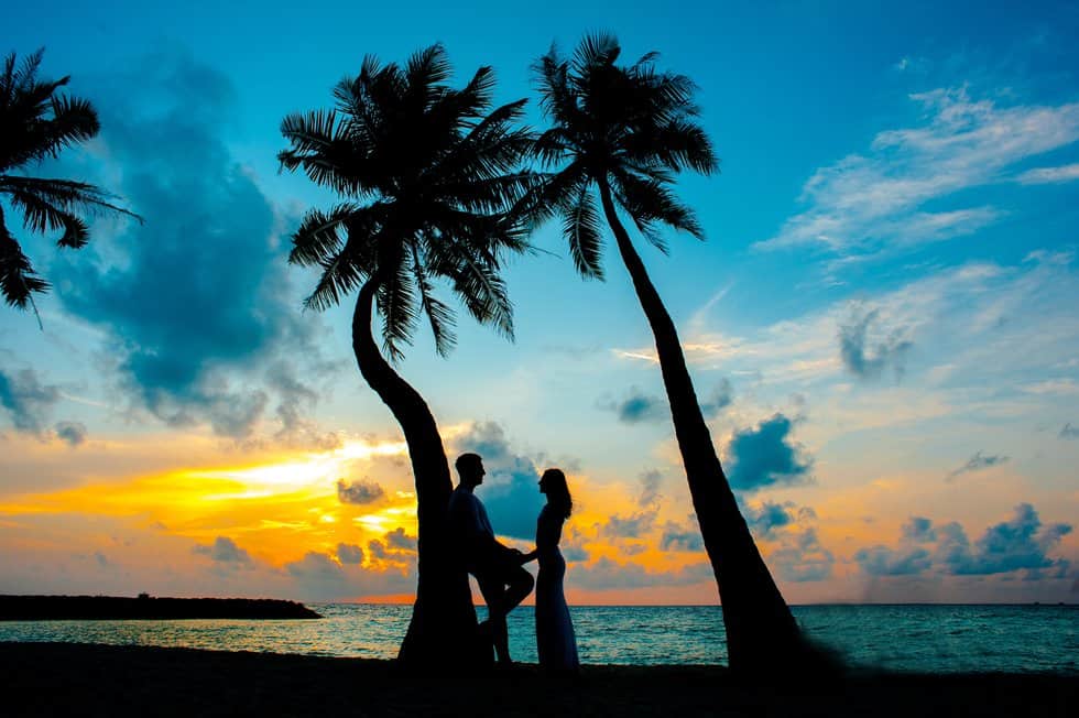
A high-contrast image has an array of black-and-white tones characterized by dark shadows, vibrant pigments, vivid accents, and concentrated textures. They feature a complete range of black and white tones from very light to extremely shadowy. These high-contrast photos are quite striking with an edgy, energetic, and powerful black and white vibe.
Street and nature photographers frequently utilize this high-contrast method to make their photos pop and bring out the photo’s textures.
Low Contrast Photography
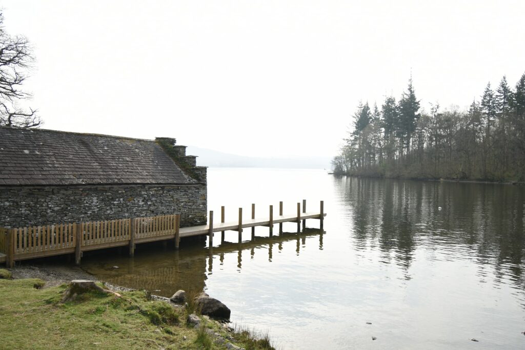
Photos with less contrast are soft with a smaller collection of tones are low contrast. Low-contrast photos work mostly in gray shades, without any highlights or dark shadows. This fusion of shades ends up dulling the low-contrast photo’s shades and making it appear dreamier.
Portraits, especially those taken outdoors, work well with this type of photography. This low contrast technique can also lend a vintage and more relaxed feel to photos because of its diluted appearance.
Comparing Low Contrast and High Contrast
No doubt, there’s a striking difference between a high and low-disparity image, yet, these two types of photography still have something in common. Whether you’ll shoot and edit your images with low or high resolutions depends on the look or mood you want for each particular shot.
What are the differences between a low and high-contrast image? What do these have in common? What’s the major factor separating the same image shot with these two components? Let’s do some digging up below:
Similarities
Contrary to what most photographers think, a high-key image is not limited to black and white, dark and light colors and tones. Apart from the grayscale, they also include bright hues and deep thick highlights or shadows. Remember, a low-contrast image also features vibrant hues and highlights.
With the right exposure, color gradient, and perfect quality settings, you can shoot a brightly colored flower over a much less vibrant background.
Differences
In a high-contrast image, there are no regions or parts where you’ll find a medium tone or a less extreme color. It’s either black or white, dark or bright, red or the opposite. Yet, low-definition images do not have extreme colors and tones, and most regions are of medium components.
A low-contrast image tends to appear grey, moody, or dreamy. When you take a closer look at these, you’ll quickly see more details in the image. However, a high-contrast image needs more details to look at. The color component makes only the subject pop out.
Major Distinguishing Factor
The degree of detail significantly differs between a low and high-variance image. With only a glance at a high-definition image, you barely tend to notice any other component of the image besides its subject. However, the low-definition variant will display more colors and details.
Most images having their contrast level on the high side tend to have fewer details because they display less color. The absence of various tones and colors allows the main subject (usually the darkest or brightest region) to cast shadows on other intricate details, covering them up.
Any image with a minimal contrast level tends to bring out more details because its color range is vast, and there are several tones in different regions. This effect makes it easier to show the components on places like people’s faces, countertops, flat surfaces, edges, and far-away subjects.
High Contrast and Low Contrast Using Color
The most contrasting shades appear opposite from each other on the color wheel. Examples include red and green and blue and orange. Placing these shades next to each other will create a striking distinction and add sharpness to your shot. You can also juxtapose warm and cool shades.
For less color disparity, photographers can choose analogous ones that appear next to each other on the wheel or use shades or tints of the same pigment for just a light distinction.

High Contrast and Low Contrast Using Tone
Tone is most significant in black and white photography which doesn’t have any additional input from pigment. High-tone contrast comes from the variability between very light and intensely deep tones.
To create less tonal variability in photos, photographers can feature an array of middle tones with no true whites or blacks. Similarly, a medium contrast image also has a range of tones but does include pure ones.
Editing for High Contrast or Low Contrast
When editing for high contrast or low contrast, your decisions will depend on the look or mood you want for each particular shot. If you’re going for a severe or mysterious look, high-contrast methods fit best. But for a light, laidback vibe, low techniques may be more appropriate.
In your editing software, you can use the contrast slider to increase or reduce the look of the entire image. Modifying the pure black and white tones of your photo can also alter the contrasts of your photo. Making whites lighter and blacks deeper will add disparity.
You can also use a brush tool to focus on particular light and dark areas of the image. All you have to do is paint the part of the photo you want to alter and adjust the slider until you reach your desired effect.
Which Type of Contrast Is Better for Real Estate Photographers?
Before delving into the ups and downs of low and high-contrast photographers, you should keep in mind that your photography needs vary based on your client’s needs. You’ll need to factor in your clients’ requirements, brand colors, and previous listing pictures.
Generally, real estate photographers are known for their incredible attention to detail. You want to cover your subjects’ intricate designs and aesthetics in every shot you take. This detail could be a sharp edge on furniture, the position, or the stairs’ engravings.
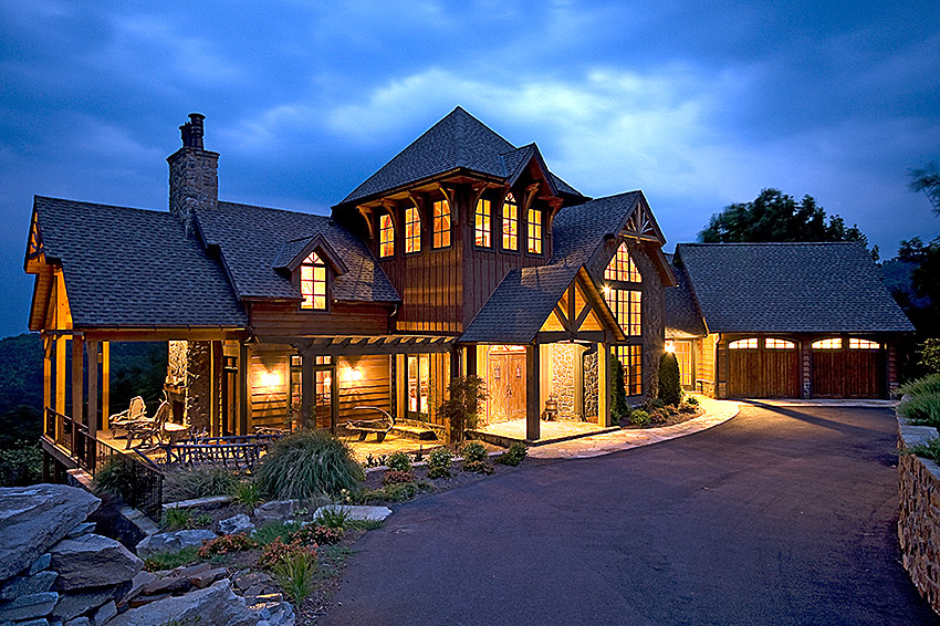
Considering all we’ve covered, what type of contrast level will enable you to add such depth to your photos? You guessed right. A low-contrast image is the most suitable for real estate photography. It covers a wide color range, making all components in your image easy to spot.
Wrapping Up
The contrast in photography refers to the degree of difference between the tones in an image. High contrast features a wide range of tones, from very shadowy to very light. Meanwhile, photos with less contrast have a narrower array of tones with less distinction in brightness.
When discussing low and high-contrast photography, photographers must also understand the techniques they can use to get a low or high contrast, both in a photo’s composition and editing.
Tone and color are two popular ways to adjust the light and dark areas in a shot, while editing tools can also help add or reduce contrasts in post-processing.
The best way to develop an understanding of low and high contrast is to experiment with creating and adjusting it to various degrees. Once you master it, the contrast will help you improve your photos by enhancing their clarity, texture, mood, and effect on viewers.
Contact Kolorheaven immediately via the Hotline at +84.899.779.111 or email: kolorheaven@cskolorheaven.com if you want to use our services.
Contact Info:
- Address: 22 TT1 – Tu Hiep auction site, Thanh Tri, Hanoi
- Website: https://kolorheaven.com/
- Email: kolorheaven@cskolorheaven.com
- Fanpage: https://www.facebook.com/Kolorheaven.services
- Youtube: https://www.youtube.com/@kolorheaven_photo_editing/videos